Mimi G

Health and wellbeing coaching · Case study

A complete rebrand for a more grounded route into better health.

Jon Bell Health needed a complete rebrand and website that could make a thoughtful health and wellbeing offer feel easier to understand, more reassuring to enter and more distinctive in a crowded sector.

Project details
Client

Jon Bell Health

Sector

Health and wellbeing coaching

Platform

WordPress

Scope

Complete rebrand and WordPress website

The moment before the work

A health conversation needs warmth, structure and the confidence to avoid easy promises.

The identity and website use natural vitality, measured information and a calmer user journey to help people understand the offer. The work avoids clinical theatre and focuses instead on a practical, human setting for a meaningful lifestyle conversation.

The guiding principle

Grounded vitality.

Forest, food, movement and warm editorial structure help the site feel health-minded and optimistic, while the page hierarchy keeps the experience clear.

The work in practice

The experience on screen.

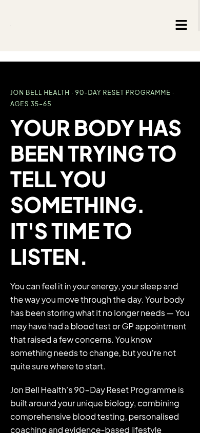
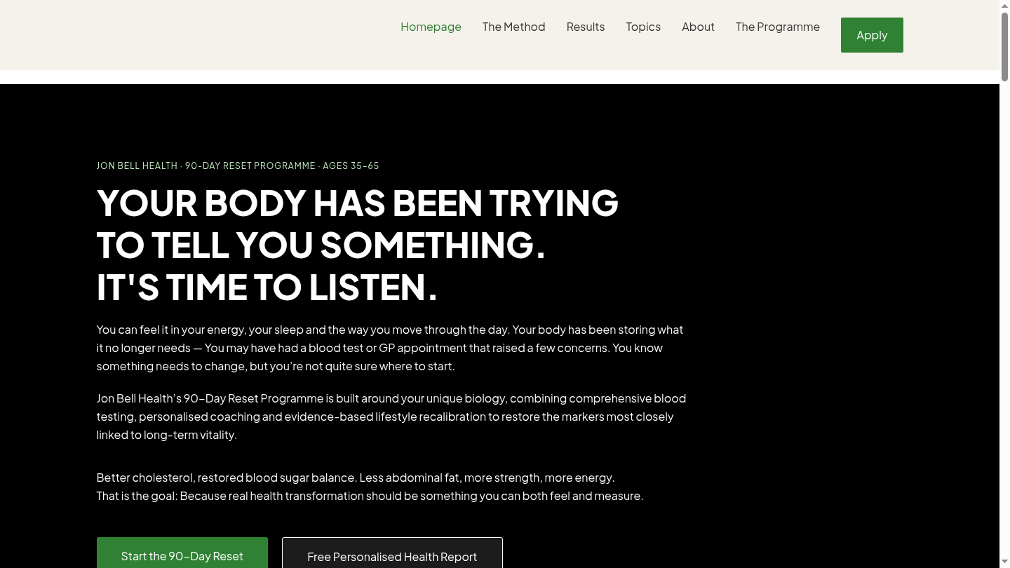
Real desktop and mobile views, shown as part of the project story rather than as a gallery of disconnected screens.

Desktop experience
Mobile experience
What the work needed to do

A considered response to a specific client world.

01

A rebrand with real calm

The visual and verbal direction creates a more coherent setting for Jon’s work, balancing natural energy with credible structure.

02

A website that reduces friction

The site helps visitors move from a personal concern to programme context and a sensible next step without overloading the page.

03

An experience built around reassurance

Content, imagery and responsive design work together to make a health-focused decision feel less intimidating and more considered.

Visual system

A brand world with its own internal logic.

Evergreen, forest imagery and natural light create a grounded wellbeing world. Clear structure keeps the experience supportive and easy to navigate.

Built to be used

The visual choices are held together by a clear, responsive content structure so the site can remain useful across desktop and mobile, not simply look distinctive in a single screen.

A considered digital experience changes the quality of a first conversation

A more useful health conversation begins with a digital experience that feels human.

If your business has outgrown its current website, a thoughtful conversation can reveal what would create the strongest next step.