Mimi G

AI, compliance and B2B SaaS · Case study

A distinct compliance identity for a product built around evidence, confidence and action.

SmartAssessor needed to become recognisable as an individual B2B proposition while making a sophisticated compliance offer easier for decision-makers to understand. The work aligned brand, website, paid activity and ongoing visibility around a clearer commercial story.

Project details
Client

SmartAssessor

Sector

AI, compliance and B2B SaaS

Platform

WordPress

Scope

Identity, website and paid visibility

The moment before the work

Technical complexity needed a more confident route into enterprise understanding.

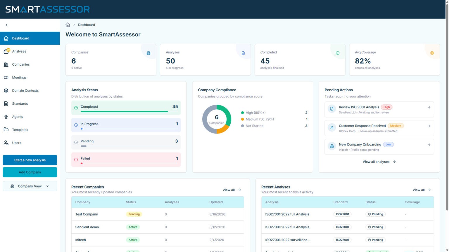
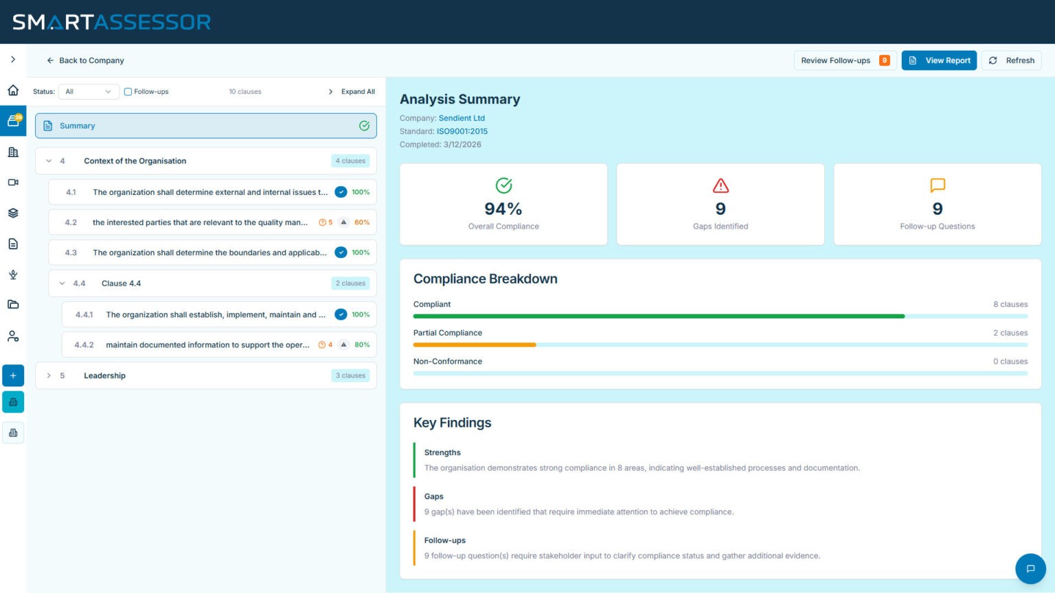
The programme has brought together rebrand, website design and build, PPC, visibility, strategy and deployment on a retainer basis. Interface evidence appears where it explains the product, while the wider experience gives regulated buyers a disciplined, human-readable path through the offer.

The guiding principle

Evidence made easier to trust.

A navy and teal system uses product detail selectively, balancing the authority of compliance with a calmer, more approachable reading experience.

The work in practice

The experience on screen.

The public-facing website and the live product interface, shown together as one coherent brand and customer story.

Compliance assessment interface
Product dashboard
What the work needed to do

A considered response to a specific client world.

01

A standalone market identity

The brand was shaped to establish SmartAssessor as a credible proposition in its own right, while respecting the bigger organisation behind it.

02

A website built around the buying journey

The experience translates technical substance into a clearer sequence of questions, product context and next-step choices.

03

Visibility as an ongoing discipline

PPC, content and visibility work are managed as part of the wider programme. During the measured PPC engagement, return on ad spend improved by 20.2%.

Visual system

A brand world with its own internal logic.

Deep compliance navy, professional teal and generous white space. Product evidence is used with purpose so the page feels credible rather than crowded.

Built to be used

The visual choices are held together by a clear, responsive content structure so the site can remain useful across desktop and mobile, not simply look distinctive in a single screen.

A considered digital experience changes the quality of a first conversation

When compliance matters, the way evidence is understood can be as important as the evidence itself.

If your business has outgrown its current website, a thoughtful conversation can reveal what would create the strongest next step.