Mimi G

Identity and visibility coaching · Case study

A second chapter for a founder whose business outgrew its first expression.

Mimi G has worked with Kirsty Mason since startup. This is the second website built for the business, alongside a full brand refresh, designed to give her Main Character positioning a stronger, more polished commercial home.

Project details
Client

Kirsty Mason Coaching

Sector

Identity and visibility coaching

Platform

Squarespace

Scope

Brand refresh and second Squarespace website

The moment before the work

Personal brand energy works best when the experience has the confidence to hold it.

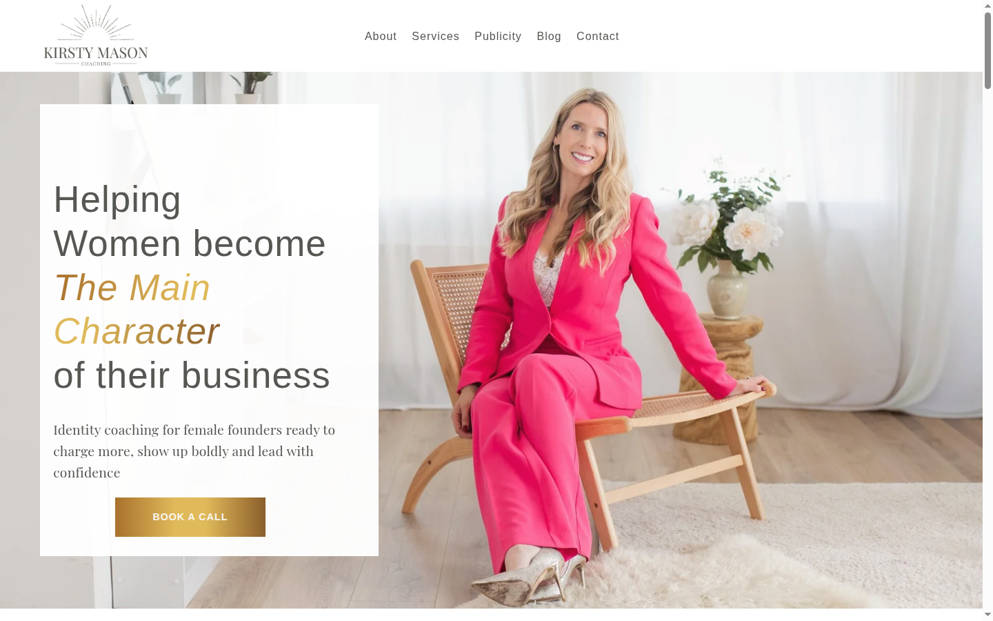
The visual system carries the conviction, warmth and visibility work that clients come to Kirsty for, while the website gives her services, story and next steps a clearer structure. The result feels expressive without becoming noisy.

The guiding principle

Champagne Standard, with substance.

Contemporary pink, editorial founder imagery and champagne energy are balanced with white space and purposeful hierarchy, so the page remains premium and easy to use.

The work in practice

The experience on screen.

Real desktop and mobile views, shown as part of the project story rather than as a gallery of disconnected screens.

Desktop experience
Mobile experience
What the work needed to do

A considered response to a specific client world.

01

A brand refresh for the next chapter

The new visual and verbal direction gives a maturing personal brand a more intentional, polished and recognisable public face.

02

A second Squarespace website

The website was rebuilt around the evolved offer, the details potential clients need and a more confident journey into booking.

03

A relationship built over time

The work reflects a deeper understanding of Kirsty’s business, from its startup foundation to the current level of visibility, identity and commercial ambition.

Visual system

A brand world with its own internal logic.

Contemporary pink, editorial founder photography, controlled champagne energy and generous white space. The aim is a confident Main Character presence, not noise.

Built to be used

The visual choices are held together by a clear, responsive content structure so the site can remain useful across desktop and mobile, not simply look distinctive in a single screen.

Client voice

“I absolutely love my site. I do not know how you did it, but you knew exactly what I wanted when I could not explain it.”

Kirsty Mason

A considered digital experience changes the quality of a first conversation

When a founder’s business evolves, the website should make the next chapter feel immediately possible.

If your business has outgrown its current website, a thoughtful conversation can reveal what would create the strongest next step.